Main area
The main area is the boards themselves, plots on one side, the data grid on the other, plus everything you can open from them (the detail modal, quick filters, selections).
Plots Board
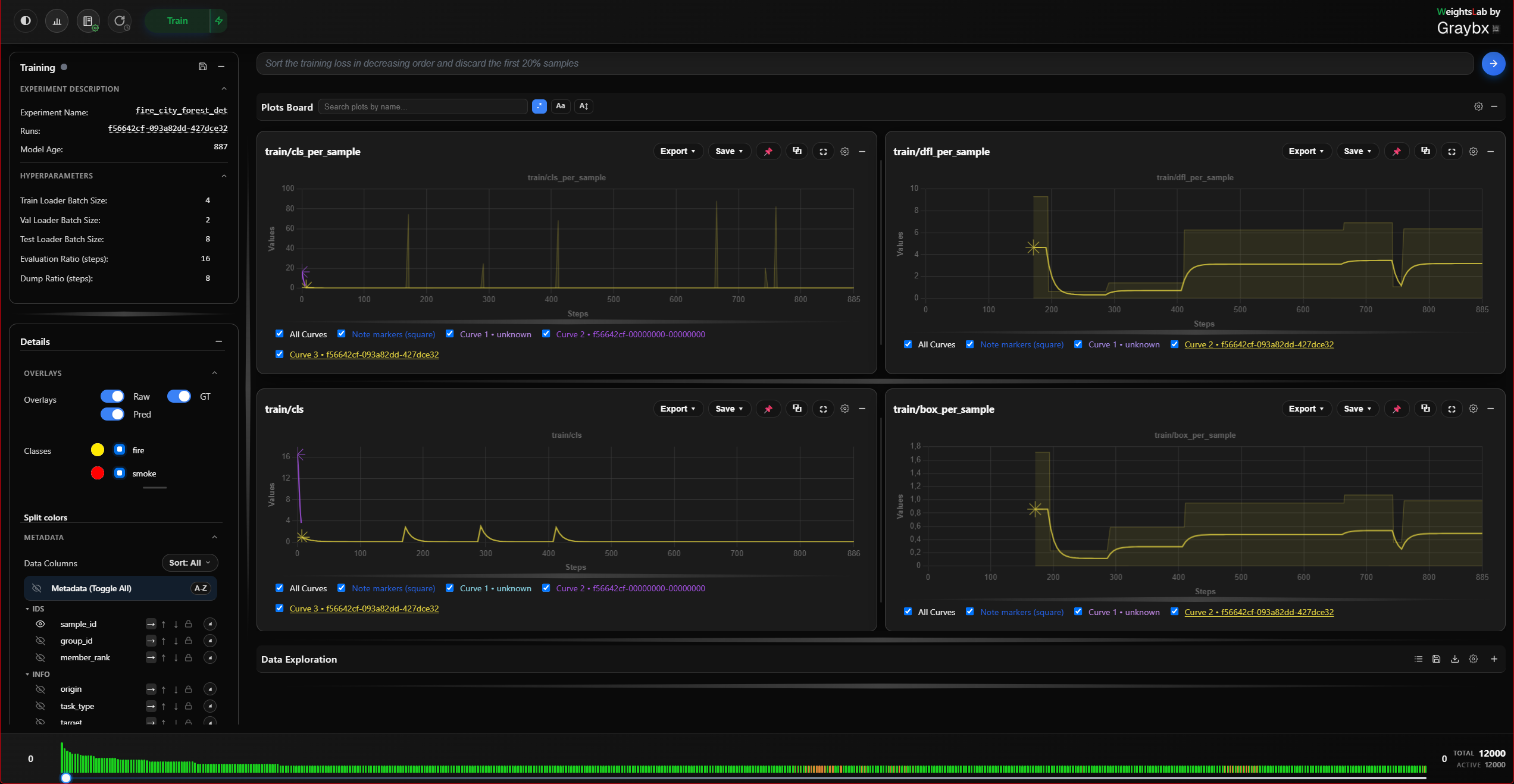
One card per signal, laid out in a resizable board. Per card: reset zoom, export to CSV or JSON, and a settings menu for curve colour, smoothing, the standard-deviation band, and markers.
Right click actions details
Right-click a plot for: reset zoom, curve colour, load weights at this step, hide/show a curve, break by slices, and copy or save the chart as an image.
Error-band details
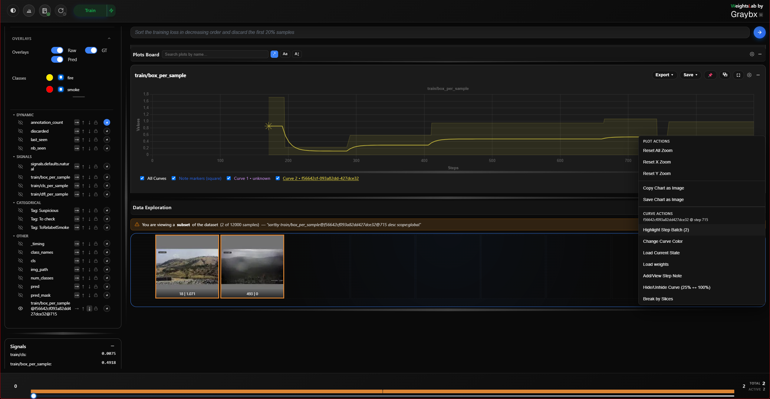
Each point on a curve is the mean of that step’s batch. The band around it is not a standard deviation, it is the batch’s actual lowest and highest sample values. A step containing one bad outlier makes the band spike out to it, so the anomaly becomes more visible rather than being smoothed away.
From a point on the curve:
Highlight step samples, filters the data grid to the whole batch behind that point, so you can look at what produced the spike.
Save step snapshot, freezes that step’s per-sample values into their own metadata column. Worth knowing: per-sample metadata otherwise only holds the latest value logged for a sample, so a spike from several epochs ago is unrecoverable by the time you notice it. Snapshot it before you move on.
Signals curves merged
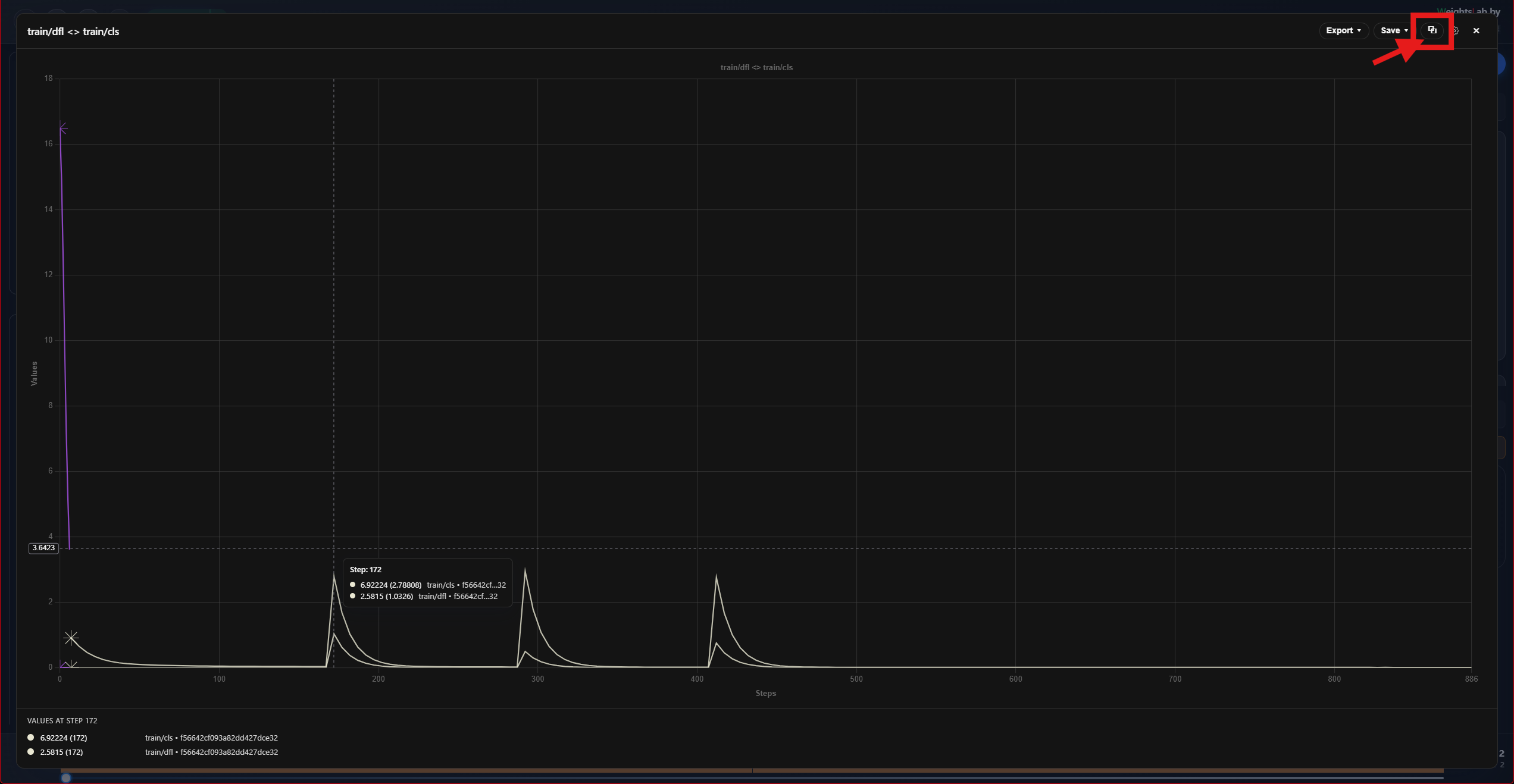
Merge two signals onto one chart to compare them directly; the merged card is
titled A <> B. Merges compose, merging again gives A <> B <> C, with
no nesting and no limit.
Merged plots are a UI-only construct: the backend never hears about them, nothing is persisted server-side, and removing one leaves the source signals untouched.
Signals curves search
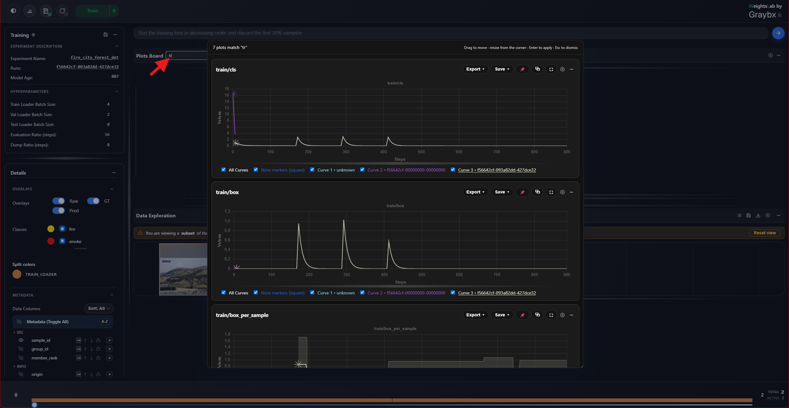
Search lives in the plots board header:
While typing, a centred popup previews the matching plots. The real cards are moved into it, so the preview is live; closing it puts every card back exactly where it was.
On Enter, the popup closes and the board reorders itself with matches first. Nothing is hidden.
Two inline toggles control matching: Aa for case sensitivity and Reg
for regex (on by default, so loss|grad finds either). With regex off, |
still separates alternatives but each is matched literally.
Resource monitoring signals
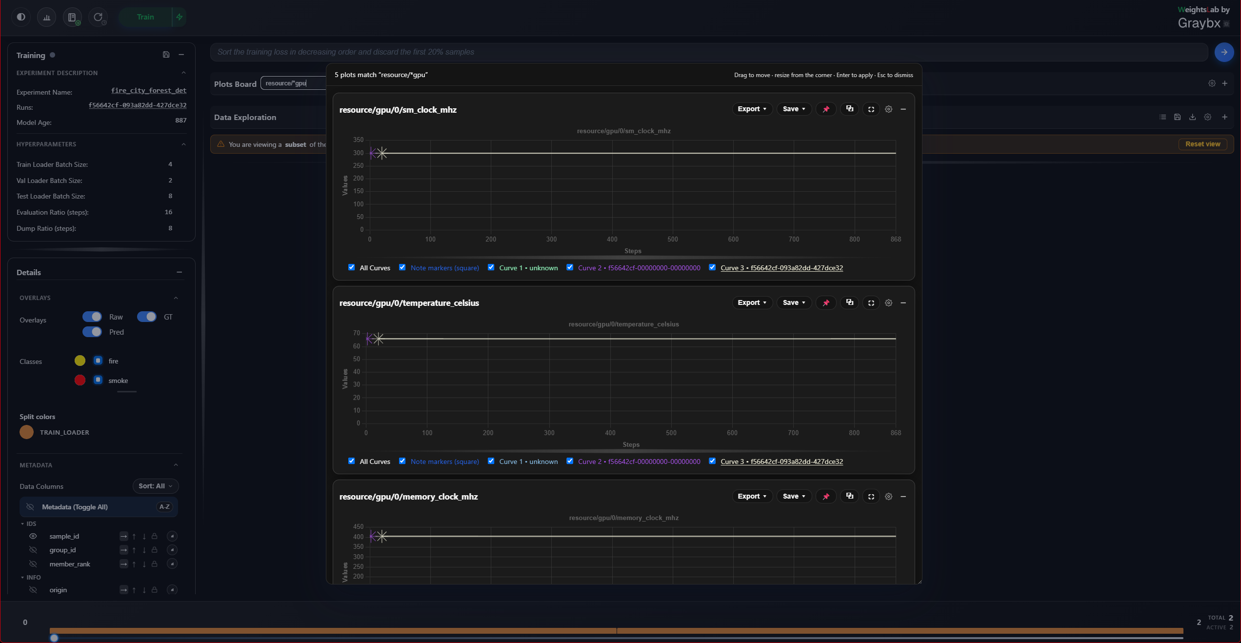
WeightsLab samples CPU, memory, disk, network, GPU and process usage in the
background for the whole life of the backend, and logs every value through the
same signal pipeline as your losses and metrics. There is no separate
dashboard: the curves land in the plots board like any other signal, named
with a resource/ prefix. This is on by default and needs no setup.
Type resource/ into the plots board search above to pull every resource
curve to the front of the board. Narrow it from there, resource/gpu for
the accelerators, resource/process for the backend process itself, or
resource/gpu|resource/memory to compare both at once (search is regex by
default).
The signals, by category:
Category |
Signals |
|---|---|
|
|
|
|
|
|
|
|
|
|
|
|
Reading them next to your own curves:
Merge a resource curve with a training signal (
resource/gpu/0/memory_allocated_percent <> train_loss) and read them on one chart. A batch-size change that moved GPU memory and a loss that moved at the same step line up visually.Resource curves restart at 0 when training does, so they stay comparable across restarts instead of carrying on from wherever process uptime had reached.
While training is paused the model’s age doesn’t move, so samples don’t stack into a vertical smear at one x, the curve simply waits.
Set WL_RESOURCE_MONITOR_STEP_SOURCE=seconds to plot against elapsed seconds
since the monitor started instead. Useful when you care about wall-clock
behaviour (a memory leak over hours) rather than per-step behaviour, at the cost
of an axis no other plot shares.
Note
Because the monitor is tied to the backend rather than the training loop, the curves keep updating while training is paused, and between experiments. A GPU that stays pinned after you hit Pause is visible here.
Configuring it: two ways, and the YAML wins where both are set.
Environment variables, before starting the backend:
export WEIGHTSLAB_DISABLE_RESOURCE_MONITORING=1        # turn it all off
export WL_RESOURCE_MONITOR_INTERVAL_SECONDS=30         # sample less often
export WL_RESOURCE_MONITOR_CATEGORIES=cpu,memory,gpu   # allowlist; others off
export WL_RESOURCE_MONITOR_DISK_PATH=/data             # which filesystem to report
export WL_RESOURCE_MONITOR_STEP_SOURCE=seconds         # x axis: wall-clock instead
A resource_monitoring.yaml file, which is the better fit when you
want to keep everything on and disable one thing:
resource_monitoring:
  enabled: true
  interval_seconds: 15
  disk_path: "/"
  step_source: model_age
  categories:
    disk: false        # everything else stays on
    network: false
The env var takes a comma-separated allowlist, anything not named is off — while the YAML takes per-category booleans, so reach for the file when you only want to switch one category off.
Situation |
What to change |
|---|---|
Shared or metered filesystem |
Point |
Long runs, board feels crowded |
Raise |
No NVIDIA GPU |
Nothing, the |
Profiling a memory leak |
|
Container with restricted |
Narrow |
See Resource Monitoring for the full reference, the config lookup order, every environment variable, and where the monitor thread runs.
Data Board
Grid mode for data exploration
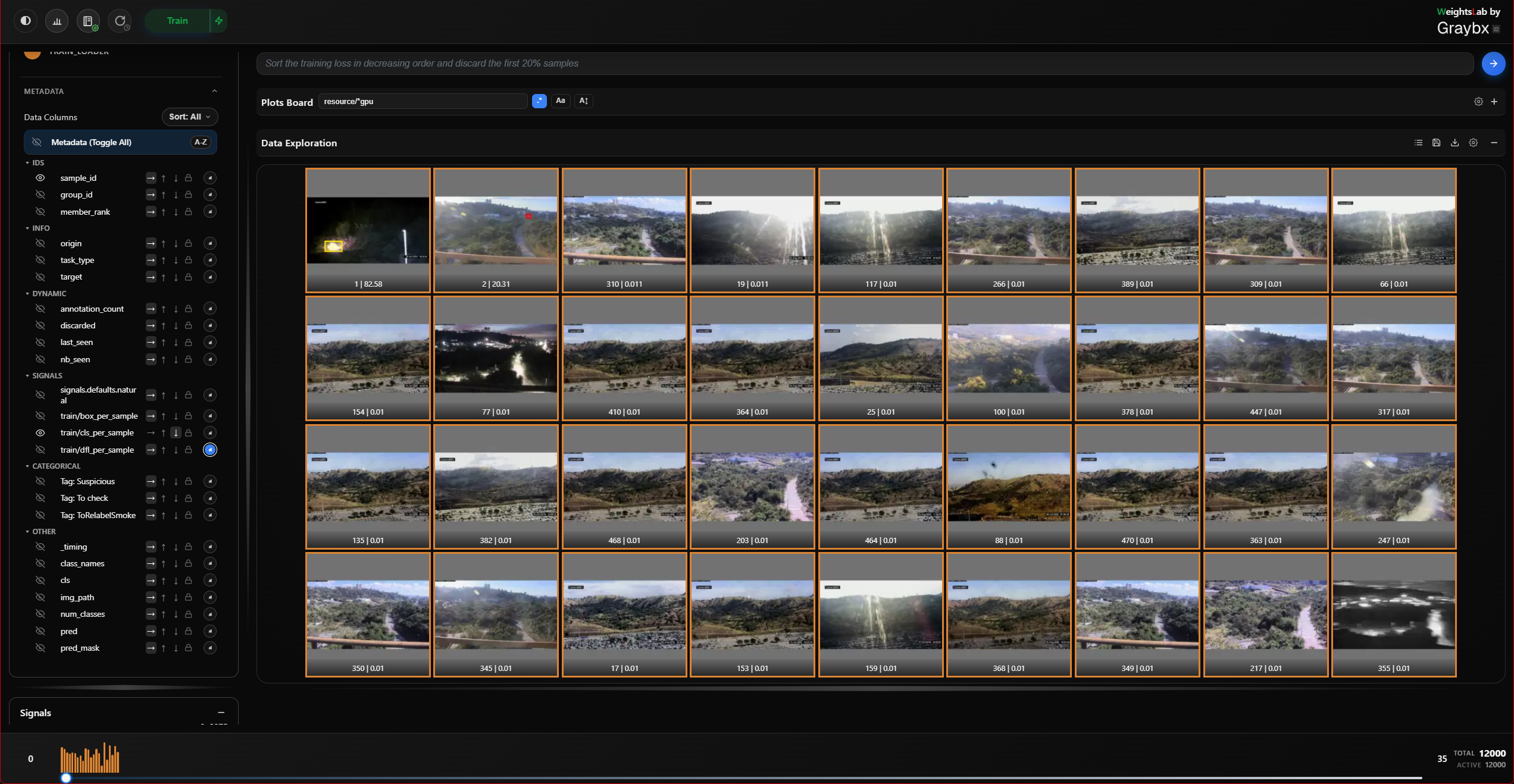
One cell per sample: the image (with whichever overlays are enabled), the metadata fields you selected, and a per-sample loss trajectory sparkline. Click a cell to open the Detail modal.
List mode for data exploration
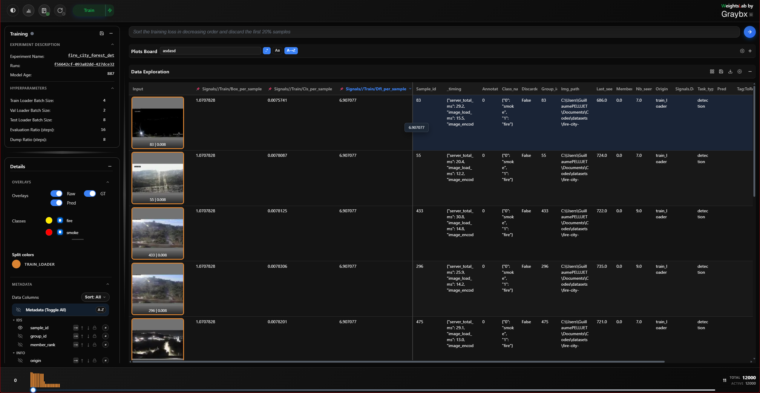
The same data as a table, one row per sample, a leading image column, and one column per visible metadata field. This is the view for sorting and comparing numbers rather than looking at pictures:
Click a column header to sort, it cycles descending → ascending → off.
Click the lock icon to pin a column so it survives later sorts.
Right-click a header for clone, delete, reset, and histogram.
Click a row to open that sample’s detail modal.
Sort state is shared with the grid, so switching views never reshuffles what you were looking at.
Quick filters
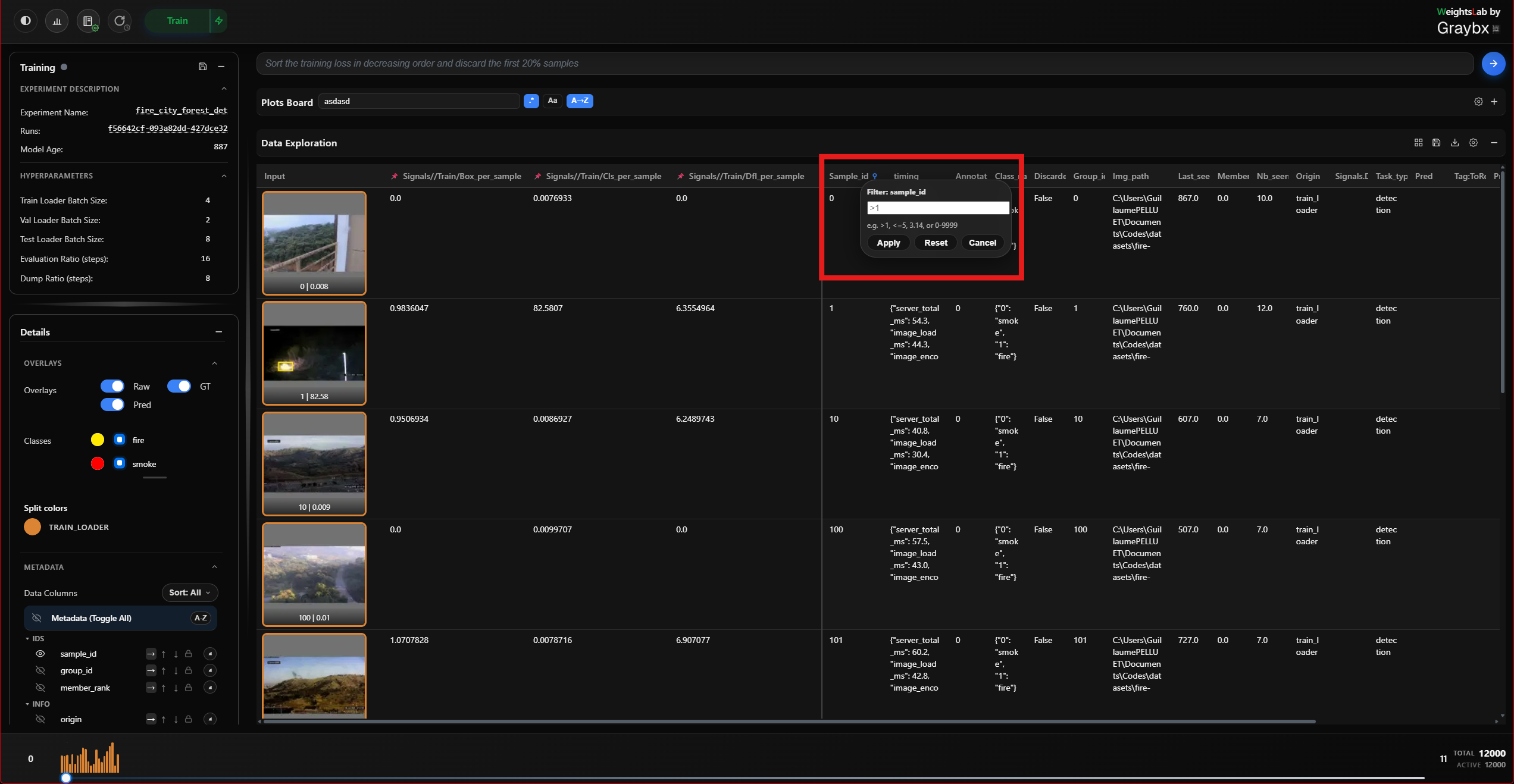
Filter and sort without going through the agent, no LLM in the loop, no
waiting. Build conditions from a column, an operator
(==, !=, >, <, >=, <=, between, contains,
has_tag, not_has_tag) and a value, stack several, and add a sort.
Use quick filters for the mechanical slices you already know you want (“loss > 2.0”, “has_tag hard_examples”) and the agent for the ones you’d struggle to express as a predicate.
Subviews and reset
When a filter or an agent query narrows the grid, a banner reports how many
samples matched and the query behind them. Reset on that banner (or typing
@reset in the agent bar) puts the grid back to the full dataset.
Selection and the context menu
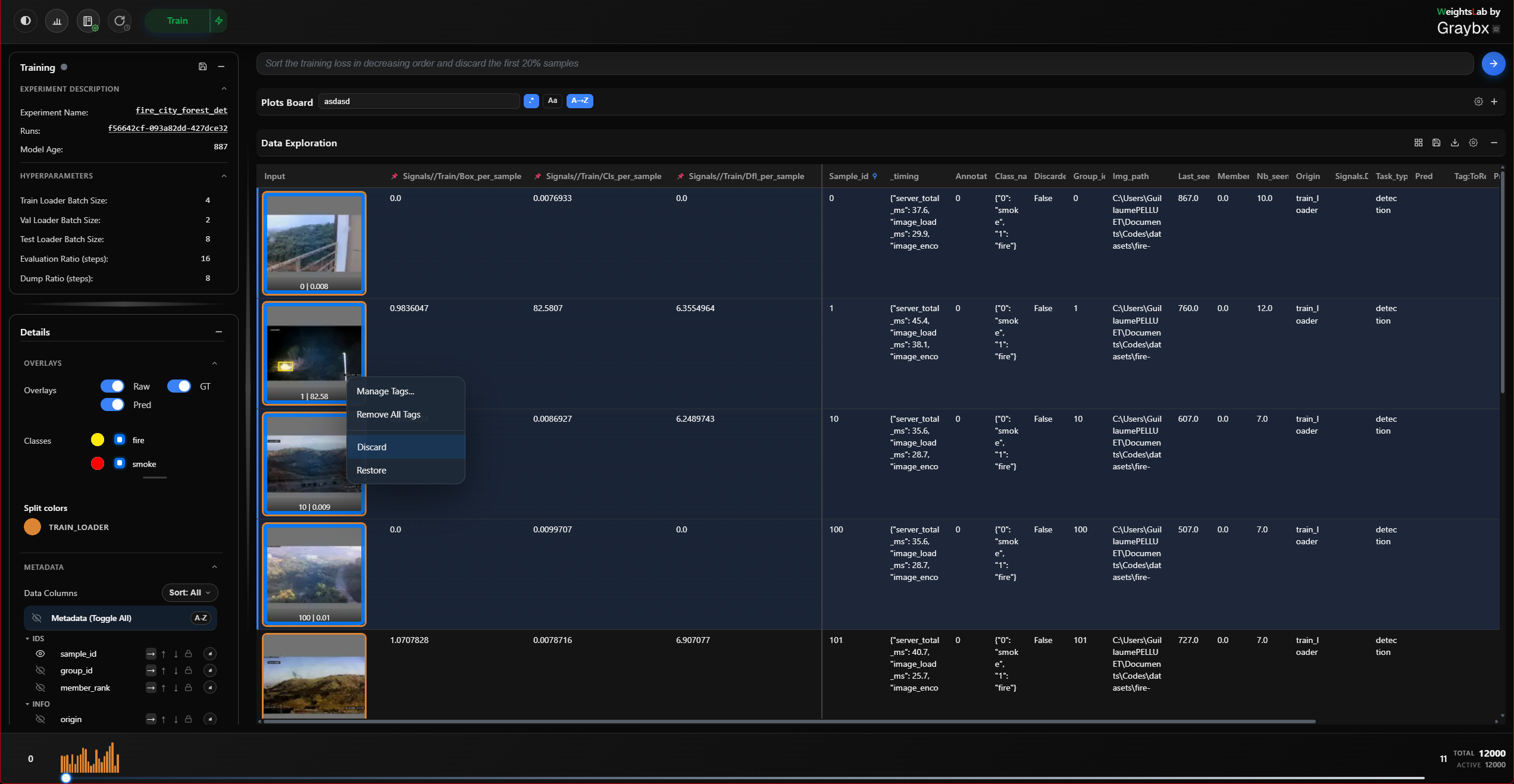
Drag a rectangle across cells to select a range.
Ctrl+click to add or remove individual cells.
Right-click the selection for the context menu: manage tags, discard samples, restore discarded ones.
Discarding removes samples from the model’s active set without deleting anything, the counter in the bottom bar shows total against active, and a discard is always reversible.
Tagging modal
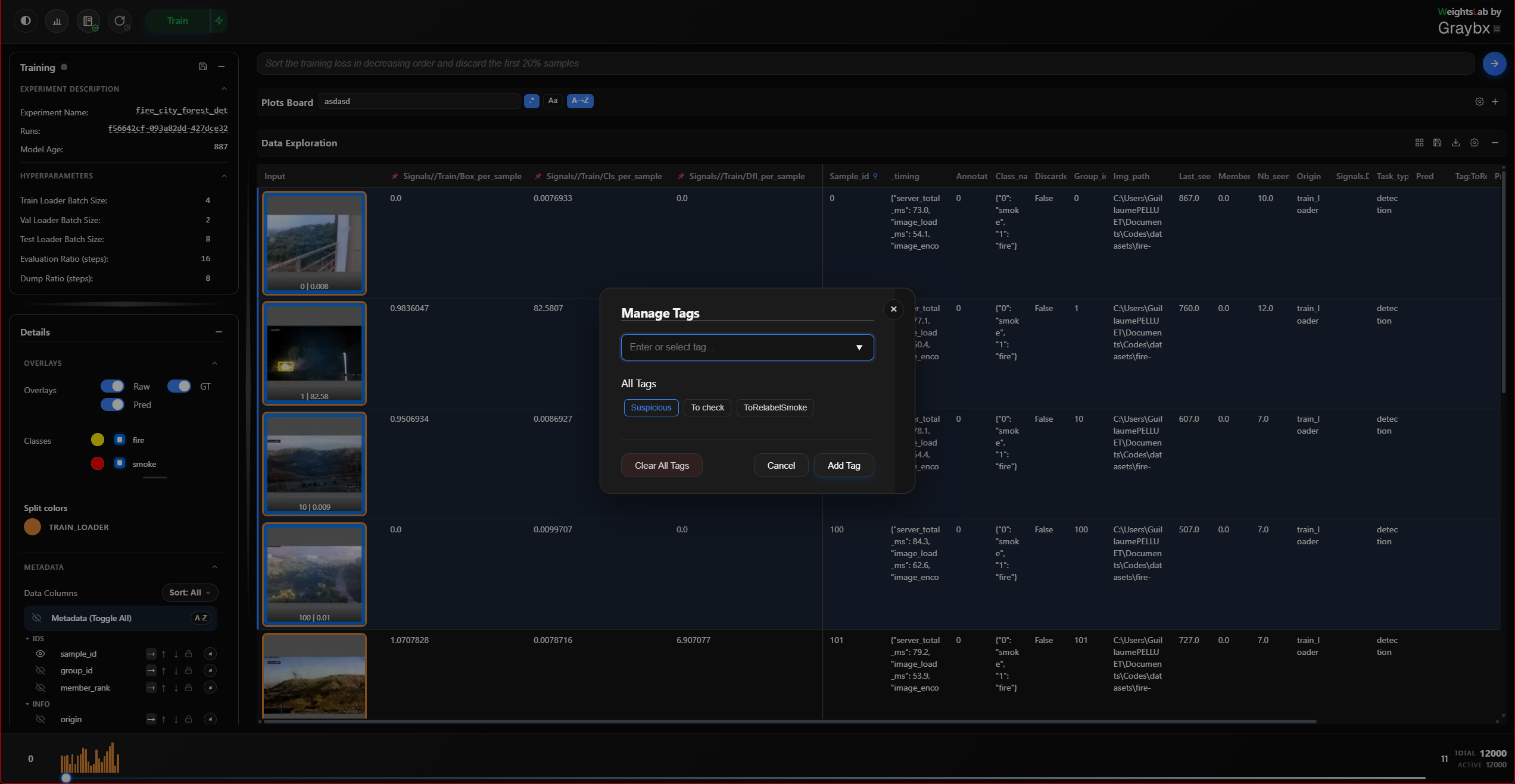
The full tag editor for a selection: existing tags, tags already on the selection, quick-tag chips, and clear/cancel/apply. Use this when applying several tags at once; use painter mode (Left panel) when applying one tag to many samples.
Bottom bar
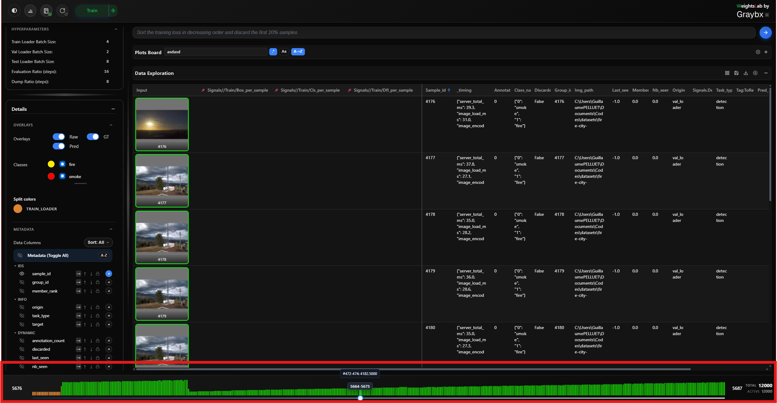
The batch slider walks through the dataset a page at a time, with the start and end sample indices either side of it. On the right: total available samples and active samples used by the model, the gap between them is exactly what you have discarded.
Detail modal
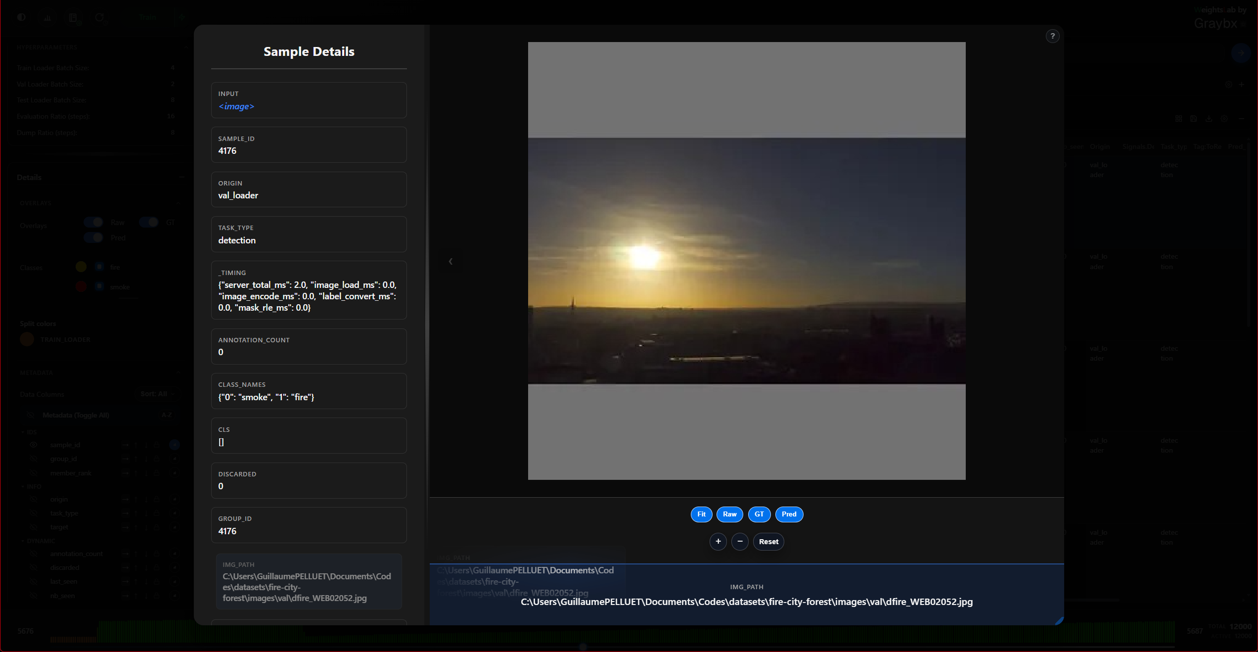
Opened by clicking a grid cell or a list row.
Navigate with the previous/next buttons or the
←/→keys — you can walk a whole filtered subview without going back to the grid.Zoom in, out, reset, or fit to the pane.
The metadata panel beside the image lists every field for the sample, and the pane divider can be dragged to give either side more room.
Overlays
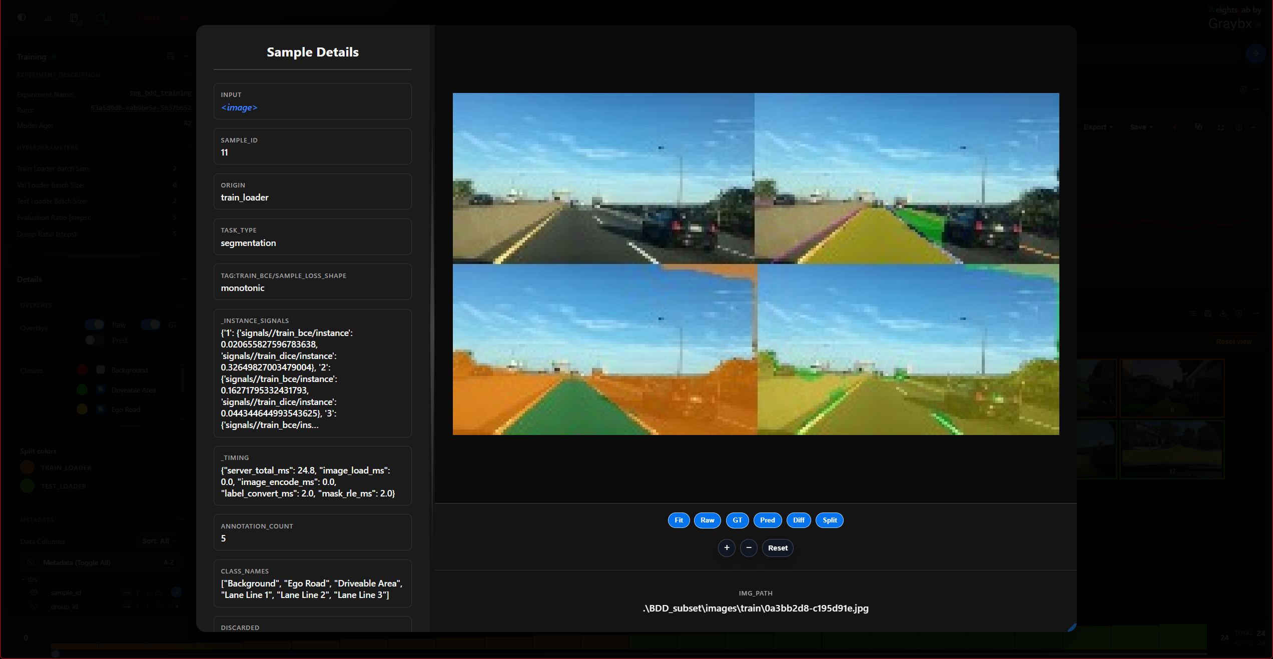
Independent toggles for raw, ground truth, prediction, plus two comparison modes:
diff, ground truth against prediction in one image.
split, the two side by side.
For detection runs, a bounding-box info control reports what is drawn; the
number of boxes rendered is capped by BB_MODAL_RENDER (and
BB_THUMB_RENDER for thumbnails).
Point clouds, video and text
The modal adapts to the sample’s modality.
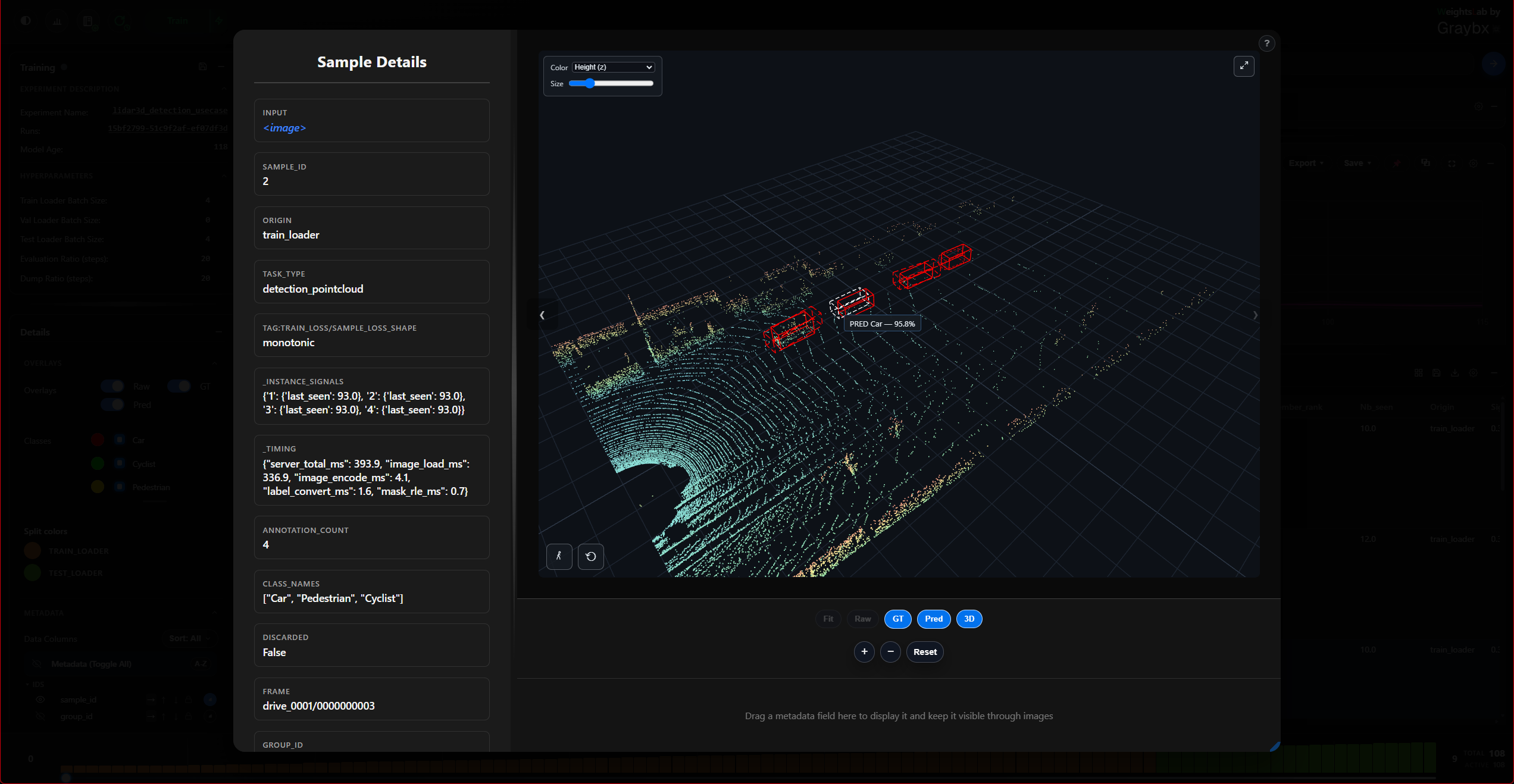
Point clouds open in an interactive 3D viewer, orbit, zoom, and expand it
to fill the screen. Cap the rendered points with PC_MAX_POINTS on very
dense scans.
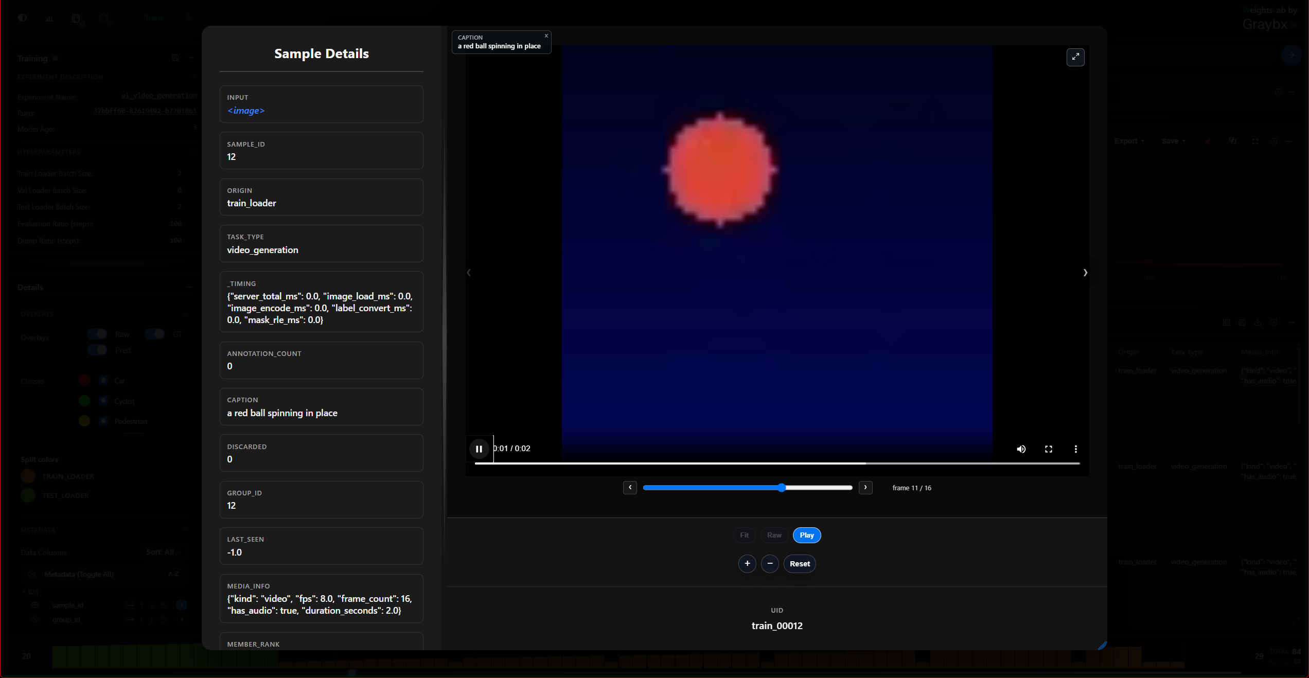
Video and audio clips get a player with frame-by-frame stepping and a frame slider, so you can land on the exact frame a signal spiked on.
Volumetric images get a Z-slice slider, and text samples render as text rather than as an image.
Projection Board
Note
Beta — the board carries a Beta pill in its header. It works end to end, but its controls may still change between releases.
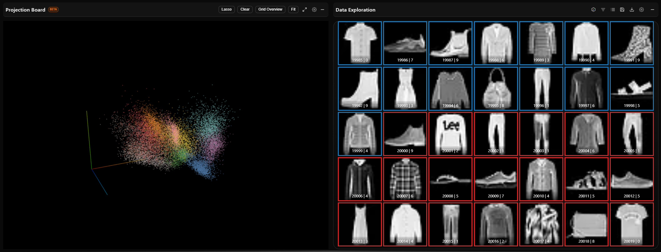
A navigable 3-D view of the representation the model is learning: one point per sample, placed by the live parametric-UMAP encoder (see Live 3-D Projection (Parametric UMAP) for the training-side half), or by a projection you computed yourself.
The board is opened from the Projection button in the Data Exploration header, and opens beside the Data board. Nothing about a run puts it on screen by itself. Opened before there is anything to draw — before the first fit, with the projection turned off, or before you plugged in your own — it shows an orange No projection found ribbon with the backend’s reason, and fills in as soon as coordinates arrive — no reload needed.
Which projection
A run can hold several projections: the live umap one, offline
re-projections from other layers, and any you computed yourself with t-SNE,
umap-learn or anything else (wl.save_projection_coords /
wl.project_dataset(method=...), see Bring your own projection). When
there is more than one, a picker in the header switches between them; with the
built-in turned off, the board opens directly on yours.
The status line counts points, e.g.
4,812 pts (of 61,004 in view) · 70,000 projected · 120 fits. The fit count
belongs to the live encoder, so it is shown only for its projection.
The axes are unlabelled on purpose: UMAP coordinates carry no units, so they are an orientation cue only.
Selecting samples
Double-click a point, or switch on Lasso and drag a loop around a region.
Either way the result lands in the Data Board as an ordinary
filter, so the grid, the list view and every existing affordance work on it. A
single click only names the point (sample 1234).
The lasso selects every sample inside the loop, drawn or not. The cloud on screen is a level-of-detail subsample (see below), so the selection is made on the server over the whole projection and applied to the Data board from there; the status line shows its size. While the lasso is armed, a line over the cloud says what the next loop will do:
Shift adds what is inside the loop to the current selection.
Ctrl refines it: only the samples already selected that are also inside the new loop are kept. A single loop selects a whole column through the cloud; rotate the cloud and Ctrl-lasso the same cluster again, and the two columns intersect in a 3-D volume — the cluster alone. The loop is drawn dashed cyan while Ctrl is held.
With Overview following a grid page, every point of the page is drawn, so the lasso simply selects the drawn points.
The projection itself is never filtered by that selection — it draws the whole dataset, with the selection highlighted. Following its own filter would collapse the cloud to the points just selected, leaving nothing to select from next. Clear drops the selection and the highlight.
Overview decides whether the cloud follows the Data board’s other filters (a query you or the agent applied). Off by default: the cloud shows the whole dataset, which is what lets you see where a filtered subset sits in the representation. Switch it on to draw only the Data board’s current view.
The other way round, right-click a sample in the grid and choose Highlight in Projection to find it in the cloud. Right-clicking inside the cloud itself is the same as Reset view.
Colour
The settings cog holds the colour picker, the point size and Reset view (camera, axes, selection and highlight).
Points are coloured by Class (the ground-truth label) by default — on a classification set, the classes are what the clusters mean. Split uses the grid’s split palette, so a sample is the same colour everywhere in Studio. Any metadata column works too: numeric columns get a ramp, categorical ones a palette. Discarded samples are drawn grey, still in place.
Level of detail
The board never downloads the whole dataset. It asks for the points its camera can see — the view frustum — up to a render budget (70,000 by default), and the server answers with that many of them; zooming in narrows the frustum, so the same budget buys finer detail. Every camera move that settles asks again. The subtitle says how many are drawn; hovering it says of how many in view.
The budget is set where the projection is served, for every viewer at once:
WEIGHTSLAB_PROJECTION_MAX_POINTS in the training process’s environment, at
most 400,000.
WEIGHTSLAB_PROJECTION_MAX_POINTS=150000 python train.py
It is read on every request, so in a run that is already going, setting it from the Studio notebook applies at the next camera move:
import os
os.environ["WEIGHTSLAB_PROJECTION_MAX_POINTS"] = "150000"
One browser can override it for itself, in its developer console (remove the key to go back to the server’s value):
localStorage.setItem('projection-render-budget-v1', '200000')
Two properties follow from the sampling being deterministic rather than random:
repeated requests pick the same points (the cloud does not boil when you nudge
the camera), and zooming in only adds points. The sample is also
stratified by cluster, at a density proportional to 1/sqrt(cluster
size): a cluster 100 times smaller is drawn 10 times denser than a flat
sample would draw it, so a small cluster cannot be sampled out of existence and
read as noise, and every class still appears when the dataset is many times the
budget.
The server keeps an index of the projection — the sampling order and a spatial grid — rebuilt in the background as training moves the points, so a view costs about what it returns rather than the size of the dataset: about 0.1 s for 50,000 points whether the projection holds one million samples or ten. The first open of a large projection builds that index once (a few seconds at 10M samples).
With Overview following a grid page, the cloud is exactly that page, drawn whole: no budget and no frustum.
The status line says plainly when the view is decimated (the of ... in
view part), so a level-of-detail subsample never reads as all the data there
is.
Arranging the boards
Every board in the main area — Plots, Data, Projection, and any added later — is dragged by its header title:
drop on the top or bottom half of another board to stack above or below it;
drop on a left or right edge to sit alongside it, splitting the width.
The board you are dragging over highlights the exact edge you will land against, and the arrangement is remembered between sessions.